Small Logo Embroidery Design Tips
Create cleaner, more readable embroidered logos by simplifying fine details, choosing suitable thread colours and matching the artwork to the garment.
A cleaner logo starts here
Why Do Small Logos Need Special Preparation?
Embroidery builds a design with thread rather than ink. Very thin lines, tiny lettering and narrow gaps may close up when the logo is reduced to a small chest or sleeve size.
A good small embroidery design keeps the most recognisable parts of the logo, removes unnecessary detail and uses a size that the chosen garment can support. This helps the final result look sharper and more professional.
Remove Tiny Details
Simplify thin outlines, small icons and decorative elements that may disappear.
Increase Line Weight
Slightly thicker strokes often stitch more cleanly than delicate vector lines.
Approve a Sample
Review a physical sample or sew-out before confirming a large uniform order.
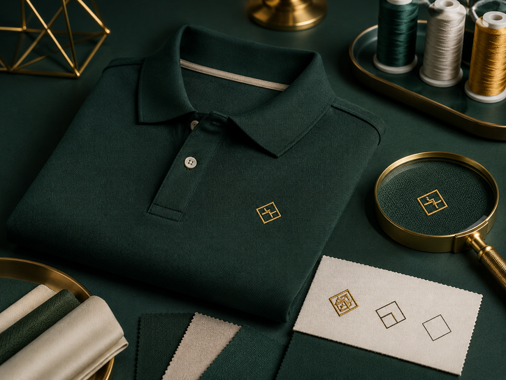
Spot the design problems early
Small Logo Embroidery: What Works and What Does Not
| Design feature | Common problem | Better embroidery approach | Why it helps |
|---|---|---|---|
| Very small text | Letters fill in or become difficult to read | Increase the size, shorten the wording or remove secondary text | Creates more space between stitches |
| Thin outlines | Lines break, disappear or look uneven | Use thicker lines or convert the outline into a solid shape | Produces a stronger stitched edge |
| Tiny gaps | Nearby stitches merge together | Widen the gap or simplify the shape | Keeps the design visually separated |
| Too many colours | Small sections become crowded | Reduce the palette to the most important brand colours | Improves clarity at a small size |
| Large solid background | Logo feels heavy or stiff | Remove unnecessary filled areas or use negative space | Reduces stitch density and garment weight |
| Low colour contrast | Logo blends into the garment | Choose thread colours that stand out from the shirt | Makes the logo easier to recognise |
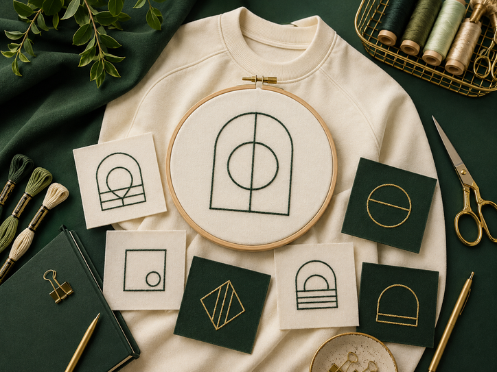
Choose the right garment base
Where Small Embroidered Logos Work Best
Polo Shirts
Polo shirts often provide enough structure for a compact chest logo. Honeycomb, pique and selected performance polos can all be considered.
- Place the logo on the left or right chest.
- Keep the design compact and balanced.
- Check fabric texture before final digitising.
- Confirm the logo does not interfere with the placket.
Corporate Shirts
Small embroidery can create a clean identity on button-up shirts when the artwork and stitch density are suitable for the fabric.
- Avoid heavy logos on thin shirt fabric.
- Keep the logo clear of pockets and seams.
- Use suitable backing for support.
- Approve a sample before bulk production.
Jackets and Vests
Many jackets and vests can support compact logos well, although linings, zips and multiple fabric layers must be considered.
- Choose a flat area away from zips.
- Check access to the inside of the garment.
- Keep dense designs away from fold lines.
- Plan visibility when the jacket is partly open.
Caps
Cap embroidery requires simplified artwork because the surface is curved and the available logo area is limited.
- Use bold shapes and short wording.
- Avoid details close to the cap seams.
- Confirm front-panel construction.
- Test readability from normal viewing distance.
Employee Names
Embroidered names can help identify staff, departments or job roles on polos, shirts and selected workwear.
- Use a simple, readable font.
- Keep capitalisation consistent.
- Check spelling before production.
- Allow enough width for longer names.
Thin Quick-Dry Shirts
Lightweight performance fabric may pucker or feel uncomfortable under dense stitching, so the design should be especially simple and light.
- Reduce stitch density where practical.
- Use compact artwork.
- Check the inside finish for comfort.
- Consider DTF when the logo is highly detailed.
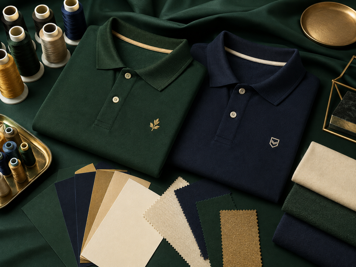
Translate artwork into thread
How Embroidery Digitising Affects the Final Logo
Digitising converts artwork into stitch instructions. The digitiser decides stitch direction, stitch type, density, underlay and the order in which each colour is sewn.
Satin Stitches
Satin stitches can create smooth narrow lettering and borders when the shapes are wide enough to stitch cleanly.
Fill Stitches
Fill stitches cover broader shapes, but large areas can increase weight, stiffness and production time.
Underlay and Backing
Suitable underlay and backing help stabilise the garment and reduce distortion around the embroidered area.
Stitch Angle
Changing stitch direction can help separate nearby shapes and give the design more definition without adding extra colours.
When Another Method May Be Better
- Use DTF for tiny multicolour details or gradients.
- Use silkscreen for simple repeated artwork on suitable bulk T-shirts.
- Use sublimation for all-over sportswear designs on compatible polyester.
- Use embroidery when a compact, premium stitched finish is the priority.
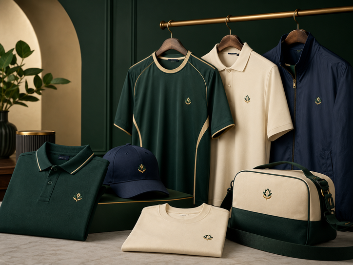
Make every stitch count
Design Rules for a Sharper Small Logo
Too Much Information
A small logo may become unreadable when it includes a slogan, address, registration details and several icons.
Decorative Lettering
Very thin scripts and complex serif fonts may lose clarity at a small size.
Similar Thread and Shirt Colours
The logo may look weak when the thread colour is too close to the garment.
Practical Design Tips
- Use the strongest symbol or initials from the full brand identity.
- Shorten secondary wording where possible.
- Use clear sans-serif lettering for small employee names.
- Increase spacing between letters and separate nearby shapes.
- Reduce the number of thread colours when the design feels crowded.
- Choose a logo width that suits the garment and placement.
- Review the logo on light and dark shirt colours.
- Create a separate embroidery-ready version of the brand mark.
Thread Colour Planning
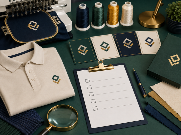
From artwork to approved sew-out
A Simple Embroidery Approval Process
Submit the Best Logo File
Provide vector artwork where available, along with official brand colours and any rules for logo usage.
Confirm the Garment and Placement
Select the exact shirt, jacket or cap before digitising because fabric and construction affect the embroidery setup.
Set the Intended Logo Size
Decide the actual width and height rather than asking for a logo that is simply “small.”
Prepare the Digitised File
The artwork is converted into stitch instructions suited to the garment, thread colours and final dimensions.
Review the Sample
Check lettering, spacing, colour, puckering, placement and overall balance on a physical sew-out or garment sample.
Approve Before Bulk Production
Confirm all corrections in writing and keep the approved sample or reference for future repeat orders.
Real-world logo decisions
Different Teams Need Different Embroidery
Compact Chest Logo
Use a simplified company mark on polos or corporate shirts for a clean, professional appearance.
Logo Plus Staff Name
Place the company logo on one side and a short employee name or role on the other.
Premium Minimal Branding
Use one small logo with strong contrast rather than adding large wording or graphics.
Symbol or Initials
Reduce the full logo to an icon, initials or short brand name for a smaller surface.
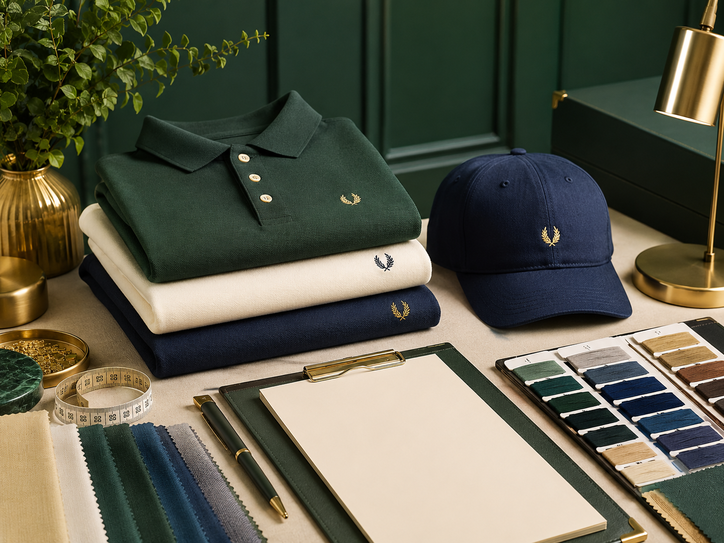
Final artwork check
Small Logo Embroidery Checklist
- The exact garment and logo placement are confirmed.
- The final embroidery width and height are specified.
- Tiny wording and unnecessary detail have been removed.
- Thin lines are strengthened where needed.
- Letters have enough spacing to remain readable.
- Thread colours contrast with the garment.
- The design is suitable for the fabric weight and texture.
- Names and job roles are checked for spelling.
- A sample or sew-out is approved.
- The approved file is saved for repeat orders.
Mistakes That Make Small Logos Look Messy
- Reducing the full detailed logo without simplifying it.
- Using very small slogan text below the main brand name.
- Choosing thread colours that disappear into the shirt.
- Placing dense embroidery on thin performance fabric.
- Approving a digital image without checking a physical sample.
- Changing garment models without reviewing the embroidery again.
Questions buyers often ask
Small Logo Embroidery FAQs
Continue planning your uniform
Useful Uniform Sabah Resources
Prepare a Cleaner Embroidered Logo
Share your logo, garment type, quantity, preferred placement and Sabah delivery location for embroidery guidance and quotation support.
WhatsApp Uniform Sabah Explore Uniform SabahOur company network
Explore Our Other Uniform Websites
Discover related uniform, apparel and custom-printing services through our regional and international websites.