How to Choose Thread Colours for Embroidery
Select thread colours that remain readable, support your brand identity and look consistent across polo shirts, workwear, jackets and other uniforms.
Direct answer
What Makes a Good Embroidery Thread Colour?
A good embroidery thread colour should provide clear contrast against the garment, match the approved brand palette closely and remain readable under normal indoor and outdoor lighting.
The final choice should also consider fabric texture, logo size, stitch density and whether the same logo will be embroidered on several shirt colours.
Strong Contrast
The logo and wording should remain easy to read from a normal viewing distance.
Brand Consistency
Use an approved thread reference for repeat orders and multiple departments.
Garment Compatibility
Review how the thread looks on dark, light, textured and reflective fabrics.
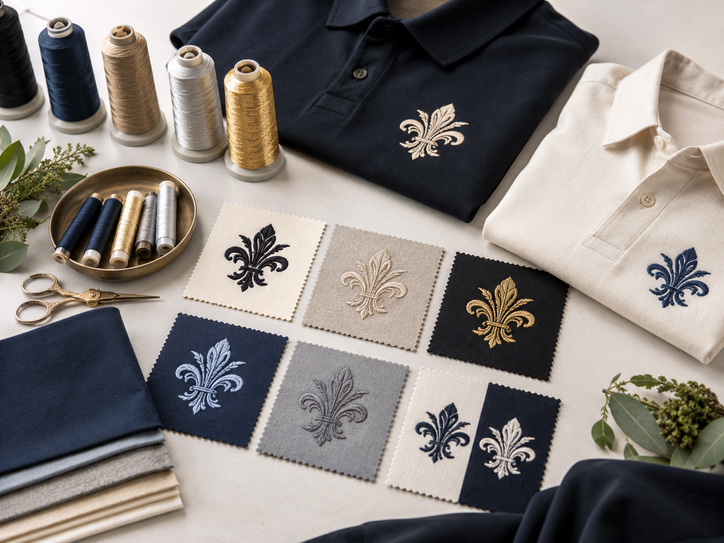
Quick comparison
Compare Common Thread Colour Approaches
Different colour strategies create different results. Choose the approach that best supports visibility, branding and garment variety.
| Colour approach | Best for | Main benefit | Planning note |
|---|---|---|---|
| High-contrast thread | Staff names, roles and small logos | Maximum readability | Use light thread on dark garments and dark thread on light garments. |
| Exact brand colour | Corporate identity and repeated orders | Stronger brand consistency | Confirm the closest available thread reference. |
| Tone-on-tone embroidery | Premium and understated uniforms | Creates a subtle, elegant finish | Not suitable when the logo must be recognised from a distance. |
| Metallic thread | Selected premium details and special uniforms | Adds shine and visual interest | Use sparingly because readability and fabric compatibility vary. |
| One universal thread colour | Uniforms using several garment colours | Simplifies production and reorders | Test the colour against every garment shade. |
| Separate light and dark versions | Multi-colour uniform ranges | Maintains readability across all garments | Keep clear records so the correct version is used. |
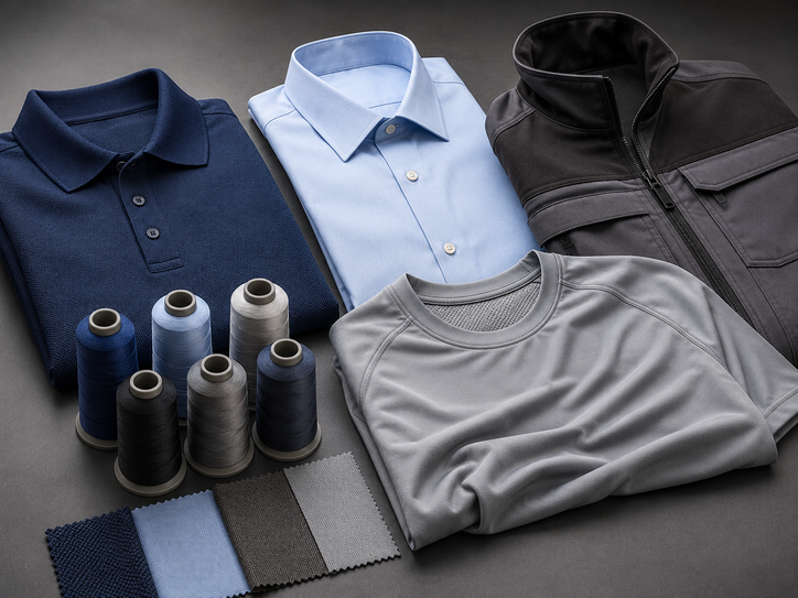
Uniform options
How Garment Type Affects Thread Colour
The same thread can look different on smooth woven shirts, textured polo fabric, microfiber shirts and heavy jackets.
Check Textured Fabric
Pique, honeycomb and Lacoste-style textures can reduce the visual sharpness of small lettering.
- Use clear colour contrast.
- Avoid very thin lettering.
- Review the stitched logo at actual size.
Use Clean Corporate Colours
Woven shirts usually support smaller, neat embroidery for office and management teams.
- Keep the palette professional.
- Check contrast around pockets and seams.
- Match the embroidery to buttons or trims when suitable.
Prioritise Visibility
Heavier jackets may be worn in dim work areas, so clear, bold thread colours can improve identification.
- Use strong contrast for names and departments.
- Check reflective panels and safety trims.
- Keep the colour visible under indoor lighting.
Lightweight Microfiber
Lightweight fabric may pucker when the embroidery is too dense, regardless of thread colour.
- Use a smaller logo.
- Limit unnecessary colour changes.
- Review backing and stitch density.
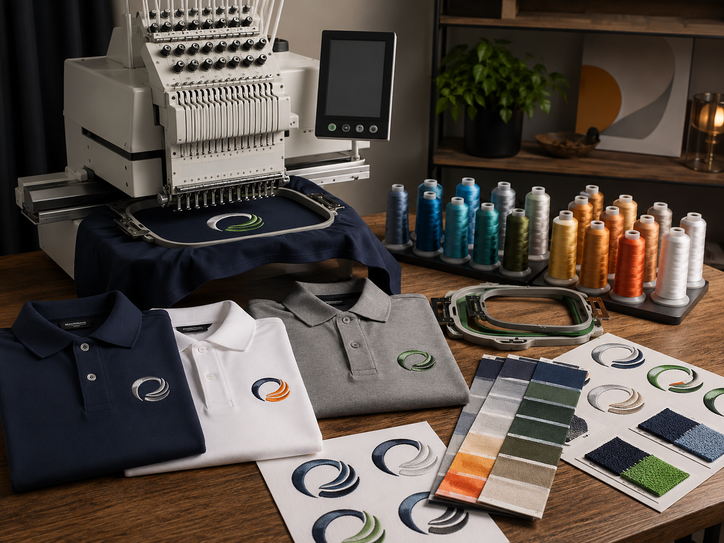
Embroidery and branding
Match Thread Colours to the Logo Design
Embroidery simplifies some logo details into stitches. Small gradients, shadows and very fine colour changes may need to be adjusted before production.
Simple and Consistent
A one-colour embroidery is easy to control and often works well for staff names, departments and small company logos.
- Choose a strong contrast colour.
- Record one approved thread reference.
- Keep all reorders consistent.
Limit Unnecessary Shades
Use only the colours needed to preserve the logo identity and readability at the final size.
- Remove tiny colour details that will not stitch clearly.
- Keep similar shades visually distinct.
- Approve the stitched sample, not only the mockup.
Use One Standard Colour
Standardising name embroidery keeps the team appearance neat and simplifies future staff additions.
- Use the same colour and font.
- Keep name widths within an approved range.
- Check contrast on every uniform colour.
Use a Controlled System
Departments can use different thread colours, but the system should remain easy to understand and reorder.
- Limit the number of department colours.
- Record the meaning of each colour.
- Add text so colour is not the only identifier.
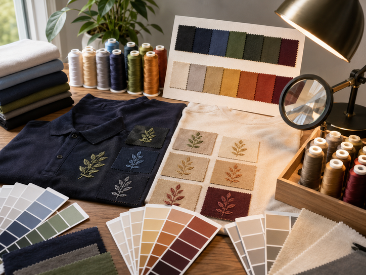
Colour and design guide
Check Contrast, Lighting and Brand Accuracy
Thread colour should be reviewed under realistic conditions. Office lighting, daylight and fabric texture can change how bright or dark the embroidery appears.
Similar Shirt and Thread Colours
The logo may look attractive up close but disappear from normal viewing distance.
Digital Colour Differences
Phone and computer displays cannot represent embroidery thread perfectly.
Missing Colour Records
Future batches may use a different shade when the original thread reference is not saved.
Useful Colour Pairing Principles
- White or light grey thread usually reads clearly on dark garments.
- Black, navy or dark green thread usually reads clearly on light garments.
- Gold or yellow can provide strong contrast on selected dark colours.
- Red thread may need a white or dark outline on similar-coloured shirts.
- Tone-on-tone embroidery should use a visible shade difference.
- Every combination should be checked at the final logo size.
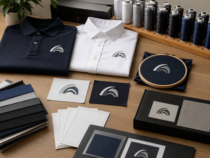
Details to Save for Future Reorders
Ordering process
How to Approve Thread Colours
Confirm the Garment Colour
Select the exact brand, model and shirt colour before choosing the embroidery thread.
Provide the Brand Colour Reference
Share the approved logo file, Pantone reference or existing corporate colour guide.
Compare Available Thread Shades
Select the closest practical embroidery thread while preserving enough contrast.
Review the Actual Logo Size
Check whether small text, outlines and colour changes remain clear at production size.
Approve a Stitched Sample
Use a sample for important corporate orders, unusual fabrics or multi-colour logos.
Save the Final Thread References
Keep the approved colours, garment model and embroidery file for future reorders.
Buyer scenarios
Thread Colour Examples for Different Uniforms
Use Light Contrast
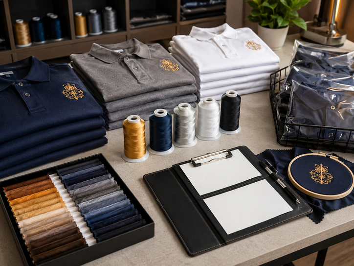
White, light grey, gold or another approved light shade can help small chest logos remain readable.
Use a Dark Brand Colour
Navy, black, dark green or another corporate shade can create a clean professional look.
Prepare Two Logo Versions
Use one colour version for light garments and another for dark garments.
Use Tone-on-Tone Carefully
A subtle shade difference can create a refined appearance without hiding the logo completely.
Buyer checklist
Embroidery Thread Colour Checklist
- The exact garment colour is confirmed.
- The approved brand colour reference is available.
- The thread provides enough contrast.
- The logo remains readable at its final size.
- Small text and outlines are simplified where necessary.
- Every garment colour has an approved embroidery version.
- The sample is checked under normal lighting.
- Thread references are recorded for reorders.
- Staff name colours remain consistent across the team.
- Metallic or special threads are tested before bulk production.
Common Thread Colour Mistakes
- Choosing colours only from a phone screen.
- Using low contrast because the shades look fashionable.
- Applying one logo version to every garment colour.
- Using too many similar thread shades in a small logo.
- Failing to save the approved thread reference.
- Approving a digital mockup without checking a stitched sample.
Frequently asked questions
Questions About Embroidery Thread Colours
Useful Uniform Sabah resources
Continue Planning Your Embroidered Uniforms
Choose Thread Colours With Confidence
Share your garment colour, logo file, preferred placement, staff quantity and brand colour references with Uniform Sabah before approving the embroidery.
WhatsApp Uniform Sabah Visit Uniform SabahOur network
Our Other Company Websites
Explore related uniform, printing and apparel services through our regional and international websites.