One-Colour vs Full-Colour Shirt Designs
Learn when a simple one-colour design creates stronger impact and when a full-colour design is worth the extra artwork and printing considerations.
Start with the message
Which Design Style Should You Choose?
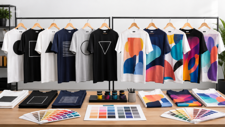
A one-colour shirt design uses a single ink or print colour for the main artwork. It often looks clean, bold and easy to recognise from a distance. It is especially effective for logos, short slogans, crew shirts and large orders where visual consistency matters.
A full-colour design can include gradients, photographs, illustrations, shadows and multiple brand colours. It gives greater creative freedom, but the artwork must remain clear on the selected shirt colour and printing method.
One-Colour Design
Best for simple logos, typography, icons and strong high-contrast artwork.
Full-Colour Design
Best for illustrations, gradients, event graphics and artwork with many tones.
Limited-Colour Design
Two or three carefully chosen colours can add depth without making the artwork busy.
Compare the practical differences
One-Colour and Full-Colour at a Glance
The best option depends on the artwork, shirt colour, order quantity, viewing distance and printing method. Use this table as a planning guide.
| Decision Point | One-Colour Design | Full-Colour Design |
|---|---|---|
| Visual style | Clean, bold and easy to recognise | Detailed, expressive and image-led |
| Artwork preparation | Usually simpler when the shapes are clear | Requires careful colour, resolution and edge checking |
| Best viewing distance | Strong for crews, uniforms and events | Best when viewers can see the details more closely |
| Shirt colour planning | Needs one high-contrast print colour | Needs the full palette to stay visible on the garment |
| Common printing routes | Silkscreen, DTF, vinyl or embroidery for suitable logos | DTF or sublimation, depending on garment and design |
| Personalisation | Names and numbers can remain simple and consistent | Can coordinate with a more complex overall visual system |
| Reorder consistency | Easier when the same ink and shirt colour are retained | Requires the same artwork file, colour settings and product details |
| Typical use | Company shirts, school clubs, volunteer crews and campaigns | Merchandise, sports jerseys, launches and illustrated event shirts |
Match the look to the purpose
Where Simple Designs Win
Company Uniform Shirts
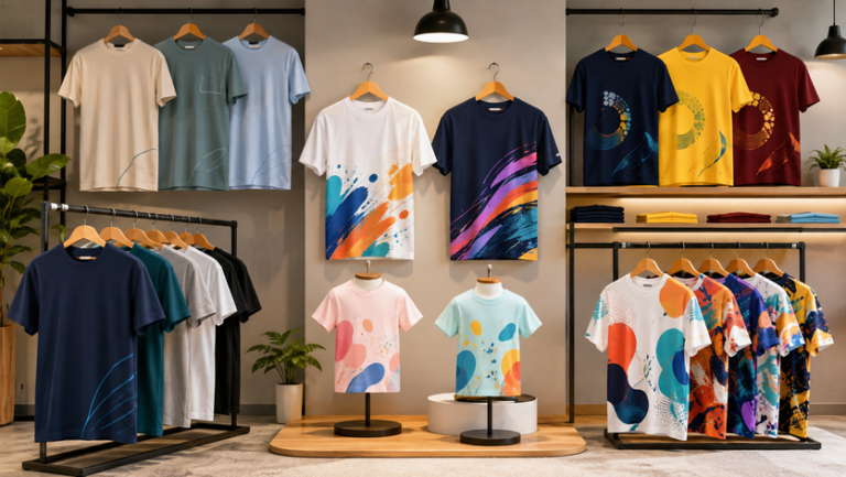
A one-colour chest logo usually looks organised and is easy to repeat across polos, T-shirts, jackets and work shirts. Full colour is useful when the brand mark genuinely depends on several colours.
School and Event Crews
Strong typography and one bold symbol can help crew members remain recognisable in busy spaces. A full-colour event visual works better when the shirt also serves as a souvenir.
Merchandise and Campaign Shirts
Full-colour artwork can support characters, scenery, gradients and layered illustrations. The design should still have one clear focal point.
Sports and Team Apparel
A simple crest and readable number system can be enough for basic teamwear. Custom sublimation is more suitable when the whole jersey needs coordinated patterns, sponsors, names and numbers.
Signs That One Colour Is Enough
- The logo already works in solid black or white.
- The shirt must be recognisable from a distance.
- The artwork mainly uses text, icons or simple shapes.
- The same design will be repeated across several garment types.
- The campaign needs a strong, direct visual message.
Signs That Full Colour Adds Real Value
- The illustration depends on gradients or tonal shading.
- Several brand colours must appear together.
- The shirt is intended as merchandise or a commemorative item.
- The artwork contains detailed characters, scenery or photographic elements.
- The whole garment is part of one coordinated visual concept.
Choose the production route
How Printing Method Changes the Decision
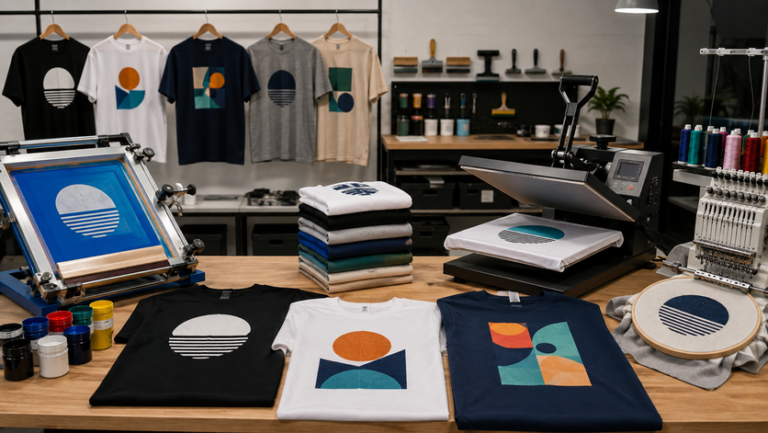
Shirt design and printing method should be planned together. A design that looks good on screen may need to be simplified, separated or adjusted before production.
Silkscreen Printing
Silkscreen is a strong option for bold artwork with clear colour areas. Each print colour affects setup, so simplified artwork is often more practical for larger quantities.
DTF Heat Transfer
DTF can reproduce multiple colours, gradients and fine details on many garment colours. Artwork resolution and edge quality remain important.
Sublimation Printing
Sublimation is suitable for custom polyester jerseys where patterns, colours, names, numbers and logos are integrated into the garment design.
Embroidery
Embroidery is not a direct replacement for photographic full-colour printing. It works best when a logo can be simplified into clear thread-colour areas.
Useful Artwork Files to Prepare
- A vector logo for clean scaling where available.
- A high-resolution transparent image for detailed print artwork.
- The original editable file instead of a screenshot.
- Brand colour references and the intended shirt colour.
- A separate list for names, numbers or department wording.
Make every colour work harder
Build Contrast Before Adding More Colours
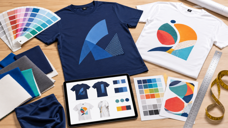
The relationship between shirt colour and artwork colour has a major effect on readability. A one-colour print can look powerful when the contrast is strong, while a full-colour image can lose impact when several tones blend into the shirt.
Dark Shirt, Light Artwork
White, cream and bright inks usually create clear visibility on black, navy, maroon and other dark garments.
Light Shirt, Dark Artwork
Black, navy, dark green and maroon artwork can remain sharp on white, grey, beige and pastel shirts.
Colour-on-Colour Designs
Similar tones can work for a subtle look, but thin lines and small wording may become difficult to see from a normal viewing distance.
Keep Full-Colour Artwork Controlled
- Use one main focal point instead of several competing images.
- Keep important text away from busy backgrounds.
- Test the artwork against the actual shirt colour.
- Check gradients and transparent effects at final print size.
- Remove unnecessary tiny details that will not be visible on fabric.
- Use a border or keyline only when it improves separation.
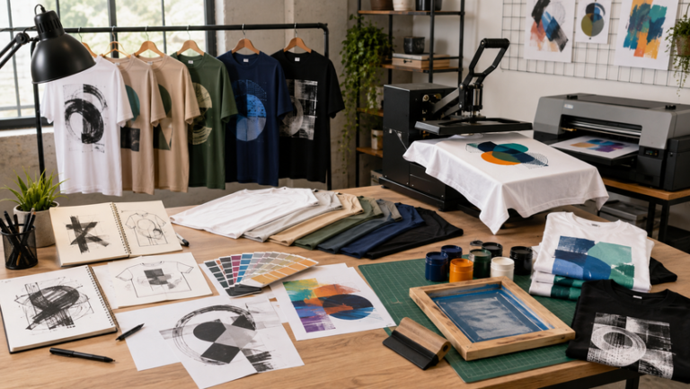
Turn the concept into a clear order
Match the Design to the Order
Define the Purpose
Confirm whether the shirts are for uniforms, events, sports, merchandise, school activities or a promotional campaign.
Choose the Shirt
Select the garment colour, fabric, fit and size range before finalising artwork colours.
Prepare the Artwork
Simplify or refine the design according to the selected printing method and final size.
Approve the Mockup
Check placement, contrast, spelling, dimensions and personalisation before production.
Common Buyer Scenarios
Office and Service Teams
A one-colour logo on a coordinated shirt colour can create a tidy uniform system that is easy to repeat for new staff.
Campaign and Launch Shirts
Full colour may be useful when the campaign artwork includes illustrations, several brand colours or a detailed theme.
School and Volunteer Crews
A bold one-colour back print can make roles easy to identify, especially when the message must be read quickly.
Merchandise and Reunion Shirts
Full-colour artwork can carry more personality, provided the final result remains readable and suitable for the chosen fabric.
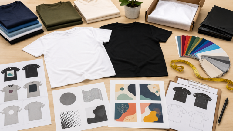
Final artwork review
Check These Details Before Printing
- The shirt colour and product code are confirmed.
- The artwork has one clear focal point.
- Text remains readable at the final print size.
- The print colours have enough contrast against the shirt.
- Small lines and tiny details have been reviewed.
- The correct printing method has been selected.
- Front, back and sleeve placements are clearly labelled.
- Names, numbers and spelling are approved.
- The full size range has been checked.
- The final mockup is saved for future reorders.
Design Mistakes That Reduce Impact
- Adding more colours without improving the message.
- Using thin lettering that disappears from a distance.
- Placing a detailed image on a shirt colour with weak contrast.
- Using a small low-resolution file for a large print.
- Approving artwork without checking the actual print dimensions.
- Sending several artwork versions without identifying the final file.
Questions before choosing
One-Colour and Full-Colour FAQs
Continue planning your order
Useful Uniform Sabah Resources
Choose a Design That Prints Clearly
Share your shirt colour, quantity, artwork, preferred placement and Sabah delivery location for guidance on a suitable design and printing approach.
WhatsApp Uniform Sabah Explore Uniform SabahOur regional websites
Explore More JC Print Services
Browse related uniform, apparel and printing websites serving different regions.